King County Transit Data Part One - GTFS Static Schedules
In Seattle Washington, we're blessed with great multimodal transit, as well apps and open data to help us get around as efficiently as possible.
Both static (schedule) data and realtime locations of transit vehicles (light right/bus /street car/etc) can be found in the OneBusAway app, which originally started in the Puget Sound Region. One of the powerful elements of the OBA app is that it ties together information for multiple regional transit agencies in a single interface.
This post will focus on the static schedule data, and later posts hopefully will cover my exploration on the realtime data offered up both by the OneBusAway API and some of the agency specific data hosts.
Static scheduling data that power OneBusAway are published by regional transit agencies in
the General Transit Feed Specification or GTFS format, originally developed by
Google in 2006, with an interesting tie-in
to Portland's TriMet transit agency
Each Puget Sound regional transit agency's GTFS schedules can be found at the following
page, as a formatted set of zipped text files conforming to the GTFS standard:
https://www.soundtransit.org/help-contacts/business-information/open-transit-data-otd/otd-downloads
Data Overview #
Let's take a look at the King County Metro GTFS Export to better understand what we're dealing with.
matthewkenny@Matthews-MacBook-Pro kc_metro % wc -l *
       4 agency.txt
      62 calendar.txt
    3300 calendar_dates.txt
      12 fare_attributes.txt
      59 fare_rules.txt
       1 feed_info.txt
     151 routes.txt
  234853 shapes.txt
 1978415 stop_times.txt
    6600 stops.txt
   56500 trips.txt
 2279957 total
The full data dictionary for each of the above text files can be found at the gtfs.org reference webpage. This reference doc outlines which files are required/optional and within those files, fields themselves that are required/optional.
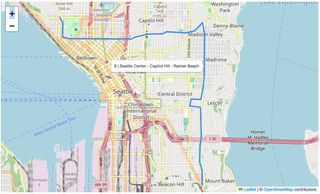
Let's follow King County Metro Route 8 in these data files. Route 8 happens to weave its way by my house in Seattle's Central District, through the dense neighborhood of Capitol Hill, past the Amazon HQ in South Lake Union, and ends all the way at the Space Needle and my personal favorite destination, the KEXP cafe an gathering space.
This route is identified in these data using a unique route_id value (100275) found in routes.txt.
See below for an example from routes.txt.
route_id,agency_id,route_short_name,route_long_name,route_desc,route_type,route_url,route_color,route_text_color
100275,1,"8","","Seattle Center - Capitol Hill - Rainier Beach",3,https://kingcounty.gov/en/dept/metro/routes-and-service/schedules-and-maps/008.html,,
An individual trip, meaning a scheduled run of a single bus on that route, is represented by a
unique trip_id value found in trips.txt. A unique trip_id is generated, I believe, for
every combination of route_id, service_id, and direction_id. Where service_id represents
the schedule e.g Weekday vs Weekend and direction_id represents inbound vs outbound.
route_id,service_id,trip_id,trip_headsign,trip_short_name,direction_id,block_id,shape_id,peak_flag,fare_id,wheelchair_accessible,bikes_allowed
100275,3105,572987776,"Seattle Center","LOCAL",0,7331487,31008004,0,101,1,1
100275,18192,599398116,"Mount Baker Transit Center","LOCAL",1,7331728,40008003,0,101,1,1
Example Analysis: Jupytr Notebook #
I first started to play with these data using a Jupytr Notebook, which I've posted to github here: https://github.com/mattmakesmaps/gtfs-exploration/blob/main/notebooks/kc_metro/data-exploration-and-mapping.ipynb.
Checkout that workbook to see some basic pandas exploration around the following:
- Find all stops for a route.
- Map all stops for a route.
- Visualize frequency of trips by hour for a given route and service (e.g weekday vs weekend.)
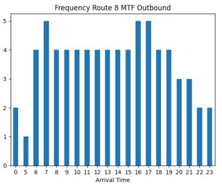
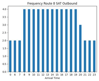
With regards to the later question for example, it was fun to see how service levels didn't decrease all that much on the weekend for Route 8. Weekday vs Weekend, it looks like the major difference are a few extra weekday trips during rush hour in the mornings and afternoons.
Example Analysis: ArcGIS Pro Network Analyst #
Jumping over to the Esri World, there are already actually a robust set of tools
already built in to take consume GTFS data and create a network dataset for downstream analysis.
Based on my understand of Esri's platform, their ability to generate a networked dataset
specific to the transportation domain predates the GTFS standard. The GTFS tools they provide
today allow a user to transform those data into their own existing transit data model.
I took the previously mentioned King County GTFS Data and used them as input into the following tutorial from Esri, Create and Use A Network Dataset With Public Transit Data. This is a very comprehensive tutorial that covers the GTFS data import, network creation, and finally a "Service Area Analysis" that allows you to generate an isochrone map depicting travel distance from one more points during a given timeframe.
For example, here is are two isochrones showing the 30-minute "travel-shed" (aka Service Area) around my house, on any given Tuesday at 3PM vs 3AM.
Tuesday 3PM: 30-Minute Bus Service Area
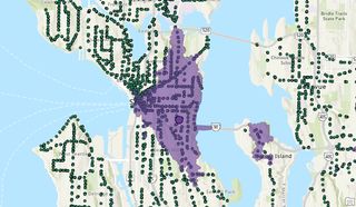
Tuesday 3AM: 30-Minute Bus Service Area
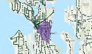
This travel-shed is based only on the schedule data and doesn't account for real-time effects of traffic congestion. If for example, the schedule is constructed in such a way that buses are regularly late/missed, that wouldn't be reflected here.
There are a number of additional weights that can be fine-tuned in this model, but this simple exercise really illustrates how easy it is to use GTFS data to quickly understand access to transit in a particular area.
I think I might try to further augment this model with data for other modes of transport serving Seattle e.g Light Rail, Street Car, Ferry. Coincidentally, Sound Transit offers a consolidated GTFS feed which aggregates all these together already: https://gtfs.sound.obaweb.org/prod/gtfs_puget_sound_consolidated.zip